
West Seattle Mercantile
Illustration | Branding | Production/Large Scale Sign Design
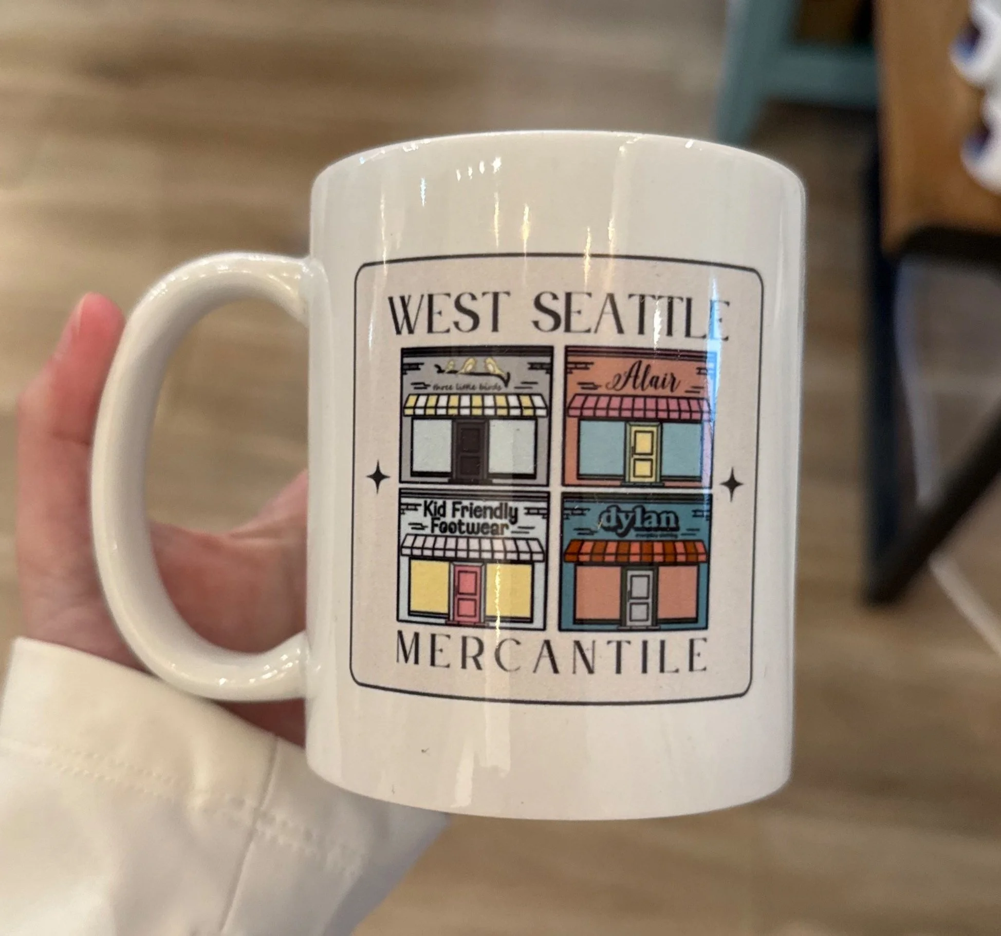
I was honored to lead the visual transformation of four beloved neighborhood shops into one unified brand: West Seattle Mercantile. After developing brand identities for both the playful children’s shoe brand Kid-Friendly Footwear and the overarching parent brand, I revisited each of the existing shops' color palettes—carefully adjusting tones to create visual harmony across all four identities. Each brand could now stand confidently on its own, while also feeling like part of the same family.


My Process
I designed a flexible logo system for West Seattle Mercantile that could adapt to different environments and formats. The four-point stars used throughout the brand are a subtle yet intentional nod to the four original businesses, serving as a recognizable shorthand when the full logo isn't practical. In the horizontal version of the logo, the store names alternate to create a sense of balance and seamlessness—important for longtime customers familiar with only one or two shops. In the stacked version, Three Little Birds and Alair appear on top due to their stronger name recognition, with Kid-Friendly Footwear and Dylan below to reflect the internal brand structure.
In addition to developing the full identity system, I designed and oversaw production of a 10-foot outdoor sign, four custom window graphics, and two interior wall graphics. I also helped plan and market the grand reopening event, which generated $4,500 in sales, boosted foot traffic, and significantly increased community awareness. Social media metrics reflected this success, including a 38.8% increase in views, 197% more content interactions, and 30.8% more direct messages during the launch period.
This project was a reminder of how much I love balancing creative direction with strategic planning. Being trusted to lead this transformation as a one-woman creative department made it one of the most fulfilling projects I’ve taken on since graduating.


